Case study
A website for a mobile workshop studio
ART AKCJA from Łódź brings materials and equipment to nurseries, schools, birthday parties and company picnics. They got a site that answers an organiser's questions before they have to write in, and a plan for getting from mockup to public launch.
- Client
- ART AKCJA, Łódź, artakcja.pl
- Role
- Mockup, rollout plan, design, build and hosting setup
- Type
- Business website with offer and enquiry form
- Stack
- Astro, Cloudflare Workers, Schema.org
- Status
- In progress: deployed at artakcja.pl behind a password, waiting on prices, photos and reviews from the client
The problem
ART AKCJA runs art and cooking workshops, kids’ entertainment and activity stations at events. They travel to the customer, so there’s no studio anyone walks past on the street. Customers found them through Facebook.
Facebook is good at showing photos from sessions and bad at answering what an organiser actually asks. A nursery head wants to know what a workshop costs for a group, whether materials are included and how far the studio will travel. A parent planning a party wants to know what happens during those two hours. “Send us a DM” means each of them has to write in and wait, and some of them simply don’t.
On top of that, four groups of customers need different things. A public institution needs an invoice and a report. A company needs several stations running at once. A parent needs someone who will clean up afterwards.
The solution
The home page walks an organiser through the decision in the order they make it.
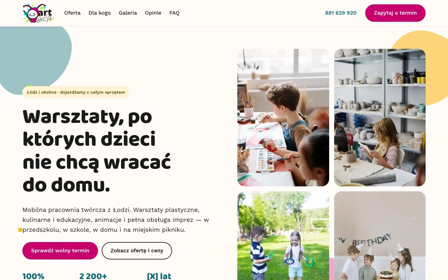
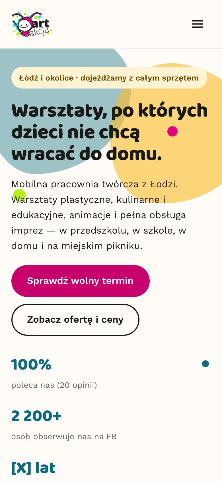
- The first screen says what this is and where it operates, with two calls to action: check a date or see the offer and prices.
- A strip of facts: we bring the equipment, groups from 8 people, sessions planned for the age group, VAT invoice with a tax number.
- Four kinds of activity: art, cooking, games and entertainment, events and picnics.
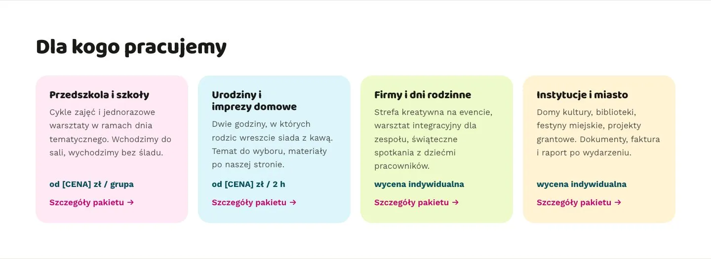
- Who we work with: nurseries and schools, birthdays, companies, public institutions. Each tile has its own description, a starting price and a link to the package.
- How it works for the organiser in three steps: you tell us what you need, you get a plan and a quote, we turn up and run it.
- Gallery, reviews and common questions: travel distance, materials, group size, how far ahead to book.
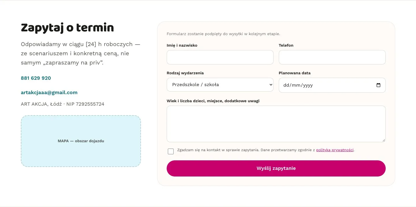
- An enquiry form with event type, date and a field for the children’s ages and numbers.
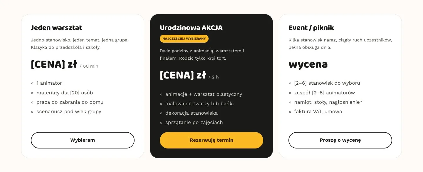
The /oferta page turns that into three packages: a single workshop, a birthday party and an event. The birthday package is highlighted, and below the packages there’s a list of workshop themes with age and duration.
Colours from the logo, text you can read
The client only had their logo as a JPG on a white background. We cut the background out with a flood fill from the edges, so the white inside the mark, the jester’s face and shirt, stayed untouched, and smoothed the edges with transparency. A square version of the mark for the favicon came from the same file.
The palette comes straight from the logo: magenta, cyan, lime, yellow and near-black. Logo colours are bright and saturated, which makes them poor text colours. The shades used for buttons and text are darkened to reach at least 4.5:1 contrast. The pure magenta from the logo is kept for decoration, and buttons use a deeper one that white text reads well on.
The paint splashes from the logo came back as the background of the first screen. A few large blobs drift slowly while small dots stay put. Hovering a button throws a four-colour splash around it, and gallery photos pop in as you scroll. Anyone with reduced motion turned on in their system gets the page without animation.
Headings are set in Baloo 2 and body text in Work Sans. Both fonts are served from the site itself, so the browser never connects to Google.
On the real address, behind a password
The site has lived at artakcja.pl from the start rather than on a temporary URL. The client sees exactly what their customers will see, and nothing has to be moved at launch.
Until the content is ready, a small Cloudflare worker sits in front of the site’s files and only lets people in after they log in. It compares the password in constant time and marks every response noindex, so the draft never ends up in Google. The redirect from www to the main domain runs before the gate, so it doesn’t ask for a login and doesn’t create a duplicate copy of the site.
Every spot that’s waiting on information from the client shows a visible placeholder in brackets: [CENA] for price, [X] km, [24] h, empty review quotes. The client sees what’s missing in context rather than in a separate document, and knows what still needs sending. The photos are stock images, documented in the repository as stand-ins. Replacing one means dropping in a file with the same name.
How it’s built
The site is statically generated with Astro. Content such as packages, tiles and questions sits in plain data at the top of each page, so changing a price is a one-line edit. Photos go through Astro’s built-in image pipeline and come out in several sizes as WebP.
Hosting is Cloudflare Workers with static assets, deployed from GitHub on every push. A custom 404 page handles unknown addresses, and page URLs work without a trailing slash.
LocalBusiness structured data lists the name, phone, email, city, service area and VAT number, so search engines can tie the site to the business listing. There’s a sitemap, robots.txt and Open Graph tags for link previews on Facebook.
The layout was designed for phones first, because that’s where a link from Facebook opens. It works from 320 px wide, form fields use 16 px text so iPhones don’t zoom in while typing, and the mobile menu closes when you tap outside it, press Escape or switch to the wide layout.
Before any code there was a static HTML mockup and a rollout plan with stages, a list of what was needed from the client and the running costs. The only recurring cost is the domain, because hosting, the certificate and the form all fit within free plans.
What this changes
An organiser who finds ART AKCJA will get their questions answered without writing in: what the studio does, who for, what’s included and how it goes from first enquiry to a cleaned-up room. Prices are laid out so that, once filled in, they can be compared on a single screen.
The client has a working site on their own domain, with the list of what’s missing built into the site itself. Next come prices, their own workshop photos, real reviews, connecting the form and removing the password gate. The plan also includes separate pages for nurseries, birthdays, companies and institutions, aimed at the phrases people actually search for.