Case study
A website for a plastic surgeon
Marta Handziak, MD, is a specialist in plastic, reconstructive and aesthetic surgery who sees patients in Wrocław, near Kraków and in Kłodzko. Her site walks a patient from the first question to a consultation request that lands directly with the front desk of the clinic she chose.
- Client
- Marta Handziak, MD, martahandziak.pl
- Role
- Content strategy, design, build and deployment
- Type
- Single-page practice website with a contact form
- Stack
- Astro, PHP, Resend, Schema.org
- Status
- Finished, awaiting deployment
The problem
Someone considering plastic surgery takes time to decide and usually looks for answers on her own before she calls anyone.
What existed about this surgeon was spread across three clinic websites and a review profile. Each said something slightly different, and none answered the questions people actually ask before a consultation. What does the price include? What happens between the first conversation and the last check-up? Will she tell me if surgery is a bad idea? Each clinic also has its own front desk, so an enquiry has to reach the one where the patient wants to be seen.
A doctor’s website carries constraints a typical brochure site doesn’t. Every claim has to hold up. The form must not collect health data. Cookie and contact consent have to be genuine choices.
The solution
We built one continuous page whose sections follow the order of a patient’s questions.
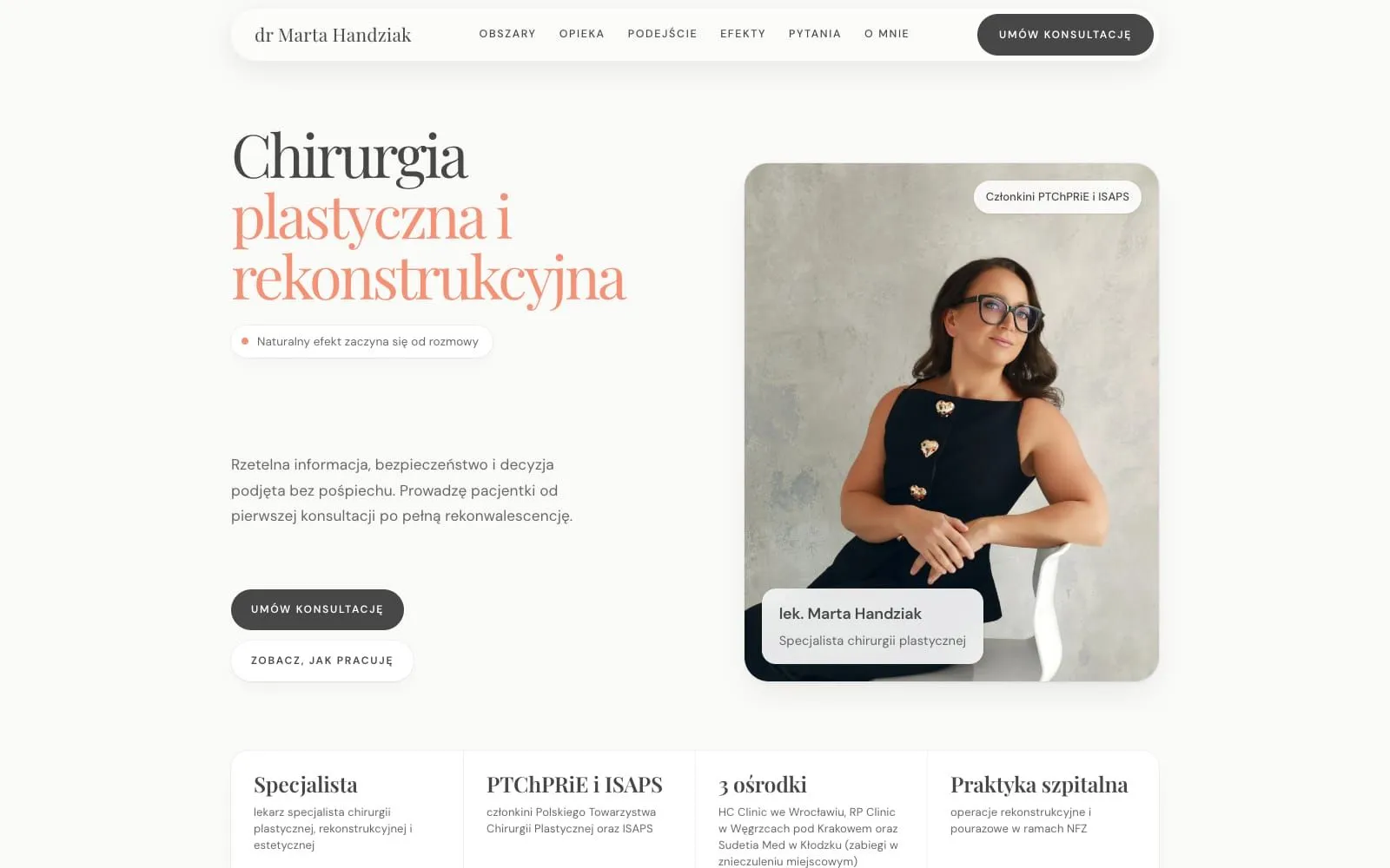
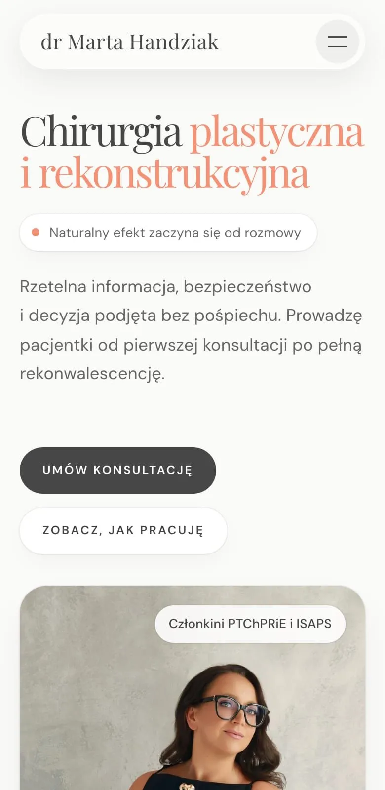
- The opening screen says what the surgeon does and how she works, with two calls to action: book a consultation, or see how I work.
- Four facts underneath: her specialty, membership of the Polish plastic surgery society and ISAPS, three clinics, and hospital practice. The mockup had a number of years in practice that no document confirmed, so hospital practice took its place.
- Areas of practice: breasts, face, the body after pregnancy or weight loss, and prominent ears. Liposuction is left out on purpose. It was her decision, recorded in the brand manual.
- What care includes: everything one price covers, from the qualifying consultation to the six-month check-up, with the list of clinics alongside.
- The patient’s path in four steps. Step two is “Time to decide”, not “Treatment plan”.
- Approach: she says plainly that she will sometimes advise against surgery, and will always explain why.
- Treatment records, published only with written consent and a note that every result is individual.
- Reviews quoted word for word from a doctor review portal, linked to the source.
- Frequently asked questions: pain, general anaesthesia, scars, time off work, price.
- About me: qualifications and hospital work.
- The contact form, followed by a thank-you page on how to prepare for the consultation.
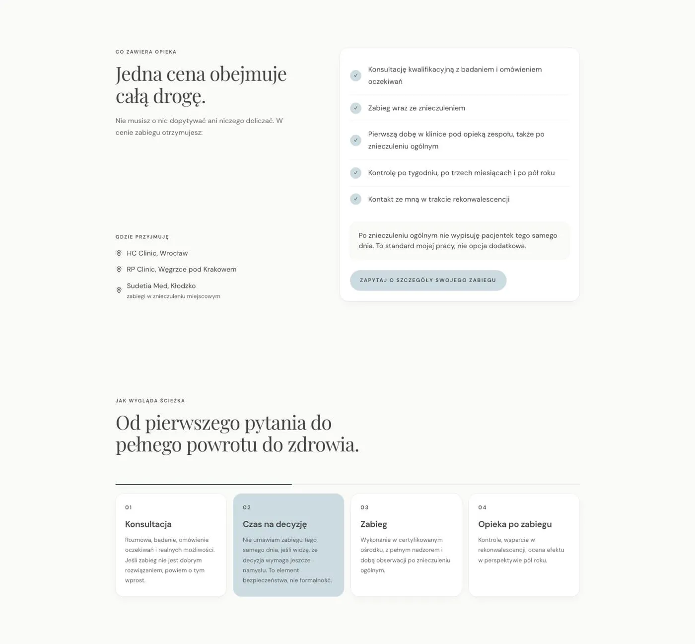
The price is not given as a figure, because it depends on the scope and the technique. Instead the page shows what it covers: the consultation, surgery with anaesthesia, the first night at the clinic, three check-ups and access to the surgeon during recovery. The closing line says patients are never discharged on the same day after general anaesthesia. That answers the fear of hidden costs better than a price list would.
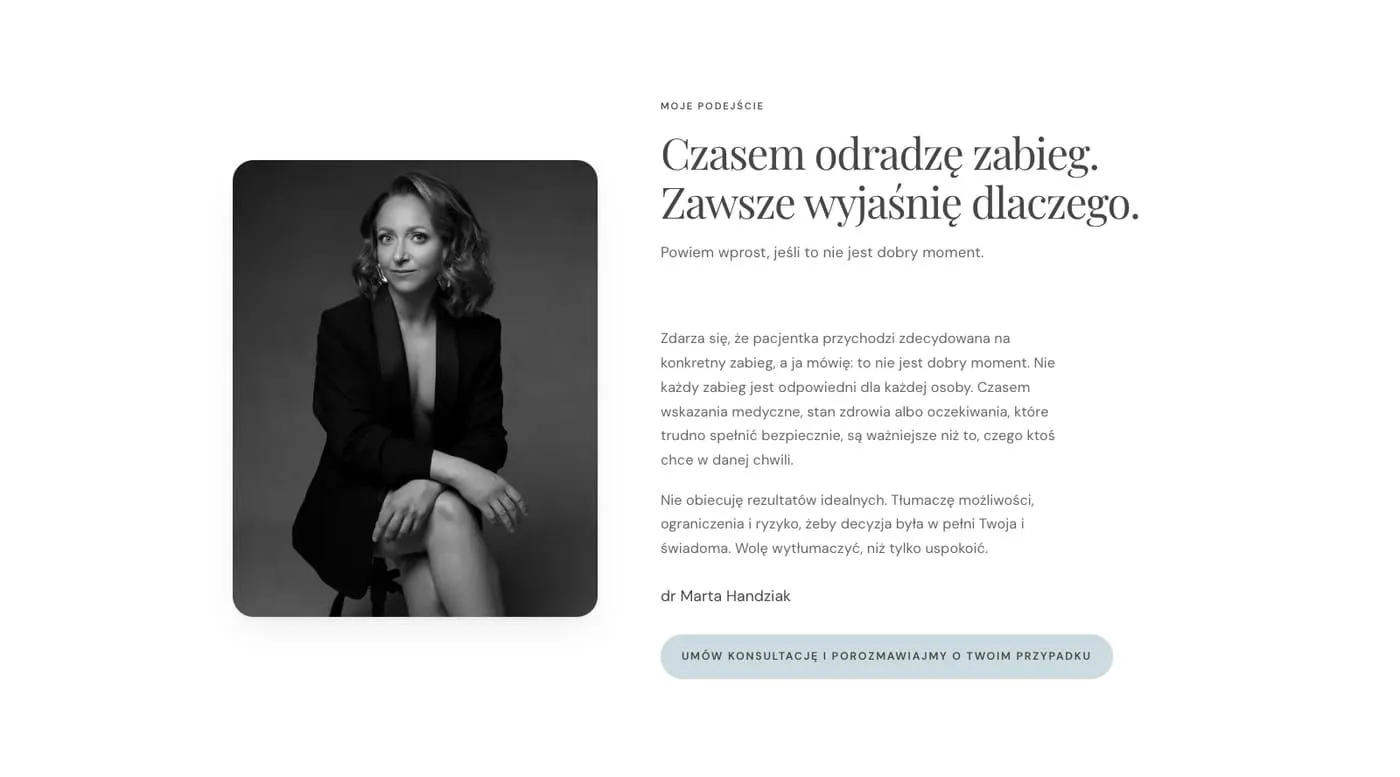
This section used to sit higher up and opened with the refusal alone. Anyone skimming read only “this isn’t the right moment”. We moved it after care and the path, and the heading now carries the whole thought.
A form that knows where to go
The form has six fields: name, phone, email, preferred clinic, topic and an optional message. Consent to be contacted sits on its own, below the rest.
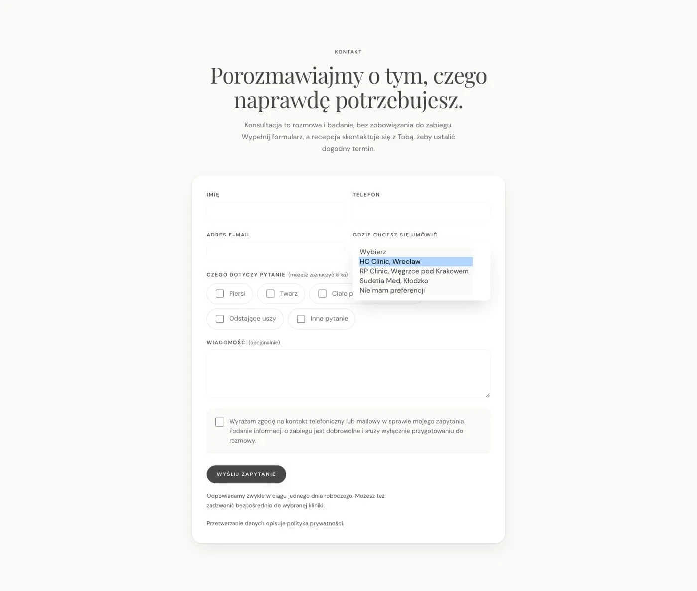
It doesn’t ask about health. There are no fields for medical history or medication. The front desk doesn’t need them to book a consultation, and any such detail on a server is a risk. The message is optional, and the consent text says that anything about the procedure is used only to prepare for the conversation.
It routes itself. The chosen clinic decides who receives the email. The front desk gets its own message with the procedure and clinic in the subject line. The surgeon and the team get a separate copy, so addresses from different organisations never appear together. If the patient has no preference, the copy says plainly that no front desk received it and someone has to follow up by hand.
It keeps nothing. Email is the only delivery route. The server log records an ID, the time, the clinic, the topic, the traffic source and whether sending worked. It holds no name, phone number, email address or message. Full details are written to disk only if sending fails twice in a row. The patient then sees an honest message instead of a thank-you, and the team deletes the record with one button once they have called her back.
No CAPTCHA. Bots are stopped by a hidden field, a minimum fill-in time and a limit of ten attempts per ten minutes from one address. The IP address is stored only as a hash and dropped when the window closes. The limit is generous because several patients on a clinic’s Wi-Fi share one address. A bot gets exactly the same response as a person, so it learns nothing about what gave it away.
How it’s built
The site is static, built with Astro, and a handful of PHP files handle the form. That lets it run on ordinary shared hosting with no Node.js. The configuration holding the Resend key and front desk addresses lives in a file outside the public directory. A generated .htaccess handles redirects, the password during preview and cache headers.
The cookie banner is our own. Rejecting is as visible as accepting, and Google Consent Mode defaults to denied before anything else loads. The tag manager doesn’t load at all until it has been configured.
Schema.org structured data describes the surgeon, her specialty, her memberships and the three places she practises. Where we don’t know a clinic’s full address, we give only its name and town, because a mismatch with a maps listing does more harm than a gap.
Headings are set in Playfair Display and body text in DM Sans, both self-hosted. The palette is quiet: porcelain white, the graphite from the brand manual, a cool pale blue and a peach accent.
What this changes
A patient finds in one place what she used to piece together from several: who the surgeon is, what the price covers, what the path looks like and when the answer will be “not now”. The front desk receives an enquiry that clearly belongs to them. The surgeon doesn’t have to worry about patient data sitting on a server, because by design it isn’t there.